Are you looking to create a beautiful, serene color palette for your brand? Do you want to refresh your current brand design? Maybe you should consider a soft pastel color palette to evoke the look you’re striving for. Our design experts here at Bunny Studio can create beautiful work with a pastel palette. You’ll love it!
The color palette’s importance to your brand
When you are branding your company, you have a lot to think about. No matter how big or small your business is, it needs a brand identity. And one of the many things to be conscientious of is your color palette. A color palette speaks in ways that words can’t, and it creates a vibe and a message that reaches the subconscious of your audience and touches on our emotions.
Some people choose a dark color palette for a strong, demanding vibe, one that speaks to mystery and thrill. A bright color palette will bring feelings of adventure, happiness, and boldness. A black and white palette evokes minimalism and essentialism. And then there is the pastel color palette. This one evokes calmness, warmth, and lightness. These colors can bring feelings of delicate nature, tranquility, and harmony. If this is how you see your brand then perhaps a pastel palette is the way to go.
Remember, the design of your brand will go everywhere your brand goes. Whether it’s on your social media, your website, or on a logo for a t-shirt, your brand should take its color and design and showcase it to the fullest extent. Make sure your color palette reflects who you are and what you stand for. It’s an immediate, visual draw that can attract and keep your customers.

What are pastel colors?
Pastel colors are those light, dreamy colors that make us think of tranquil beach days with beiges, blues, and greens or maybe an ice cream parlor with pinks, mints, and creams. Pastels work well together or with other colors as accents. Whether you want a rainbow of pastels or a monochrome brand design, you can’t go wrong incorporating these soft, soothing, yet fun and youthful colors into your brand designs.
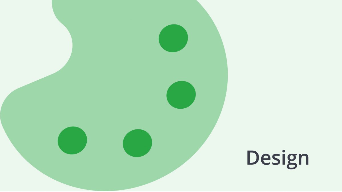
Pastel colors
Let’s look at our favorite pastel colors for a moment.
- Pink – Almost all words do have color and nothing is more pleasant than to utter a pink word and see someone’s eyes light up and know it is a pink word for him or her too. – Gladys Taber. In other words, pink makes us happy. It brings delight and brings us together. It’s calming and sweet and paints a lovely image.
- Blue – From calm oceans to peaceful skies, pastel blue denotes tranquility and peace. Incorporating pastel blue into your brand and color palette can evoke a calm, trusting world.
- Purple – This is a soft whimsical color that can let us enter a fantasy world of dreams and fancy.
- Yellow – Pastel yellow is the color of calm. It shows us a light-hearted, hopeful feeling and is associated with laughter, hope, and sunshine.
- Green – Pastel green takes us to the newness of spring when green starts to enter the world again. When you are looking for a fresh pop of pastel color, green can freshen things up.
These aren’t all the pastels by any stretch, we’ve still got peaches and beiges, grays, and even pastel reds. Each color speaks to something and working with them can tell a whole story.
What a pastel color palette can signify
Pastel colors are definitely in the spotlight these days. When you begin to think about how to design your brand, pastel colors may come to mind. Pastels evoke feelings of wellness and whimsy and have a calming effect. That’s one reason businesses in areas like photography, wellness, floral design, bakeries, and beauty are drawn towards the pastel palette. If these colors make us feel calm and serene, we may be more drawn to the products they are showcasing. A logo in a soft color palette will draw in customers looking for that moment of tranquility amidst a busy, hectic lifestyle.
How to use pastels
Now that you’ve decided to incorporate some pastels in your color palette, you need to think about how you’d like to do this. When you’re considering a brand color palette, remember, your brand is going to show up in a lot of spaces. For instance, your logo will be on your social media platforms, your website, your packaging, and marketing material. You may even decide to create merch with your brand, which means your colors will need to look good wherever they go.
All pastels
Some graphic designers love to incorporate a full pastel color palette in their work. Let’s think about branding for a spa. This is a great place for pastels as we want to share a feeling of tranquility and peace. However, be careful not to overwhelm the eye. Many designers will stick to a color palette of three pastels, maybe blue, green, and beige colors. This will maintain the theme of tranquility without going overboard or adding too much.
Depending on your business, you could incorporate different combinations of pastels, sticking to three colors. Think of green, pink, and yellow pastels or pink, purple, and blue. Use the pastels that complement one another to keep a cohesive look.
A pop of pastel
If you want to work with a pastel color, but not a complete pastel color palette, think about using one pastel as an accent. A single pastel color against a neutral palette looks sophisticated and professional. This is a basic of graphic design and always turns out well. Our own Bunny designers love to work with this concept for creating great brands.
You may decide to use that pastel pop against any color. Combining it with beiges and neutrals, as we mentioned, affords a sophisticated, urban feel, while placing a pastel with dark tones, even black, denotes a bit of fantastical mystery. We love a single pastel color against clean white to offer a feeling of bright, clean simplicity. Think images of the blue Aegean Sea against the white sands and buildings of Greece, and you’ll know what we mean.
A single color
Another favorite way to incorporate pastel colors in your brand designs is to focus on one color. Let’s think about pink. If your design sticks with pink and takes a few tones of it, you can create a beautiful brand design. From subtle pastel pink to deep raspberry, your brand design will be cohesive and pleasing to the eye. This can work with any color and affords a beautiful, sophisticated aesthetic.
What aspects of your brand can take on pastel colors?
If you’re wondering how to use pastel colors, think big! It’s not just your logo that can wear these lovely pastels, it’s anything you want. Remember Jay Gatsby and his closet full of colorful shirts? If he can take on a pastel color palette, anyone can! Maybe you want the interior of your shop or office in pastel colors or your website and social media in pastels. Don’t forget packaging which can have your logo and even included stickers or goodies. Oh, that makes us think of merch. Whether or not you’re a clothing brand, you can offer t-shirts, stickers, mugs, or anything to showcase your brand. And pastel logos look great on black, white, gray, or even another pastel color. The only limitation you have here is your imagination.
A bit more on color
Remember, the tone of the color will determine the feeling it evokes. A bright yellow may stand for caution while a soft yellow speaks to calm. The same goes for blue. Think of the sea and the different tones it takes on – a dark stormy sea can mean adventure or danger, but a calm blue relaxes us and takes us to tranquility.
Different cultures also have different connotations regarding color, so it’s important to be aware of these. This is where it may benefit you to work with a professional designer who is aware of all of the components of color.
Hiring a brand designer
Whether you have decided on your color palette or not, you may be considering hiring a brand designer to help you with your visual concepts. Here at Bunny Studio, we think it’s a great idea! Our designers can work magic on your brand, and you’ll love the result.
It may seem overwhelming at first to find a designer to work with, and you may fear that they’ll take over and you’ll lose your vision. It’s important when hiring that you find someone to enhance what you already feel and who will listen to what you want. No one wants to receive a brand design that they paid big money for and be disappointed.
Our Bunny Studio designers are skilled in color design and always listen to our clients. You’ll get just what you asked for. Another great reason to hire a designer to help is that it frees up your time to allow you to focus on other areas of your business that you excel at.
The big takeaway on the pastel color palette
Love was a feeling completely bound up with color, like thousands of rainbows superimposed one on top of the other.― Paulo Coelho
We love pastels. No wonder the pastel color palette is such a trend right now. This color palette can do amazing things for your brand whether you are looking to create a new brand or update what you currently have. Colors evoke feelings and emotions and are important components of designing a brand. If you are envisioning a pastel color palette for your business or even just a single pastel with a mix of other colors, reach out to us to hire a designer. Our designers can bring your vision to life or help you define your brand and create a color palette just for you. You’ll love it!