Backgrounds; they trivially sit right at the edge of your peripheral vision while covertly making or breaking visual aesthetics. People never quite focus on them, but seemingly, they have psychological powers to lull consumers into a must-have trance. We say designing pattern backgrounds requires the artisan craftmanship of a designer. Too humdrum-bare, and they won’t make an impactful impression; too many logos and the clutter will “kill the cat.” Customized backgrounds and illustration wallpaper can solidify your brand.
Hence, it’s never just about having a soothing desktop wallpaper or presenting a meeting with a pretty Microsoft team virtual background. It’s so more. In this article, we talk about the whats, the hows, the whys of pattern backgrounds. Furthermore, we’ll dish out insider tips from brand experts and graphic designers to help you to find the perfect brand pattern background.
What’s Difference Between Wallpaper & Background
Interchangeable in most cases, but specific in others, the term “wallpaper” is an image used as a background both on digital devices and on physical walls. Meanwhile, the term “background” has broader applications. It encompasses digital formats and can also be used for other physical items such as brand packaging, photographic backdrops, and even stationaries. While some people might flag this as a poh-tay-toh, poh-tah-toh question, understanding the difference between them can better help you to convey what you need, especially when working with professional designers.
Why Pattern Backgrounds are Important for Brands
Brand patterns are an interesting element because they take up plenty of clear space. In addition, they help to set the mood and personality associated with your brand.
Bringing Brand Elements Together
Like the glue that brings all other elements of your brand together, your brand pattern background, if done right, can help you build a cohesive look and feel. Some pattern backgrounds have become so iconic they surpass the need for a prominent logo. Brand patterns usually carry similar themes, shapes, or colors with a brand’s logo. They give you more flexibility with applying your brand’s design while at the same time communicate a consistent brand voice.
Making an Impression
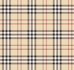
They give depth to a brand by subtly creating an impressionable experience. Take the familiar khaki checkered pattern background below, for example. Simple, elegant, and prototypical, it screams “Burberry” at a glance, even before you can locate a logo. In addition, brand pattern designs are proven to increase engagement from customers and employees. They are an effective way of making your stakeholders an ambassador for your brand, and hopefully in a positive way!
Building Brand Trust Among Consumers
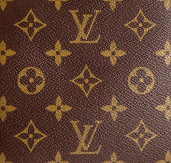
Did you know that a consistent brand image can increase sales revenue by up to 23%? Consequently, setting your pattern background shouldn’t be an all-fun-and-games fickle decision. Consider wisely and make your decision worthy. Branding best practices recommend sticking to one or similar variations of one like Louis Vuitton’s below. While switching things up may be fun, it makes brand recognition difficult. Consistency can sometimes distinguish your brand from an imposter one, especially once its identity is well-established.
![]()
This is the reason why plenty of international brands include their pattern background as a part of their brand guidelines. The brand guidelines, or guidebook, is a manual on portraying your brand’s look and feel. It dictates rules on how to apply the logo, contains specific Pantone colors related to the brand, as well as the font family used in marketing collaterals. It is a tool shared with all designers and marketers who work with the brand in order to establish consistency. Consequently, a brand’s image consistency promotes better memory recall and instills consumers’ trust in the brand.
A Guide to Creating and Using a Brand’s Pattern Background
While creating a brand’s pattern background may require some theoretical understanding of design basics, it’s not impossible to do so yourself. Here are some tips that can help you craft the right look and feel of your brand design image.
Step #1: Identify Your Brand Personality
Your pattern background defines how you present yourself to your consumers or audience. In order to strike a chord that sticks, your pattern design needs to relate to your demographic on the most basic level. This is part of emotional marketing, a repeatedly tested and proven brand strategy over the last decade. Emotional marketing allows consumers to feel a brand first before logically thinking about it. It’s intuitive, compelling, increases a consumers’ trust in the brand by 8.4 times, and boosts a brand’s sales revenue by 23%.
How does this relate to your brand’s pattern design, you ask? Building consumer relationships with a corporate image should be a personal experience. This means understanding the demographics and interests of your target audience. Using this, you can effectively compose a personality for your brand that appeals to and translates to engagement and conversions. And part of the brand pack includes designing a pattern background that is attractive to them. Below are some factors you can consider while sketching out your brand’s personality and how you can translate them into patterns. In the process of doing so, decide what part of your identity sets you apart from your competitors.

What are your Brand Traits?
Are you a B2B or B2C brand? B2B brands tend to require a more professional, corporate image that is less “fun.” For example, using squares, triangles, rectangles, and straight lines in your pattern design has been proven to translate to order, predictability, strength, and reliability.
If you’re a B2C company, the possibilities are infinite. Do you want to be considered a trendy, exciting, and forward-thinking brand? Or perhaps, a trustworthy, approachable, and empathetic brand? What is the gender of your target audience? The use of thin lines, for example, communicates femineity, flexibility, and elegance – all of which are traits that attract women.
What is the Age of your Brand?
No, we don’t mean how long your brand has existed. Rather, if your brand were a human being, how old would it be? The answer directly relates to your target demographic. Are they children, working professionals, or the elderly? Using curved lines in your patterns in the form of a floral background, texts, or shapes tends to exude more energy, agility, and fluidity – all of which appeal to the younger generation. On the other hand, the use of smooth lines over jagged lines depicts a more calming, confident, and soothing feel – all of which are suited to an older demographic.
Step #2: Apply Your Brand Colors
Already established a brand but are looking to do a brand makeover or revamp? If you don’t already have a brand guidebook, we recommend hiring a graphic designer and establishing one. In the process of applying colors to your brand’s pattern background, try not to stray too distant from your logo colors. It’s important to make sure that your pattern background complements the other elements of your brand’s design in order to present a cohesive image. While the intensity of colors can be flexible, it’s imperative you stick with your brand’s color palette. Here’s an example of a color palette taken from a brand’s guidebook.
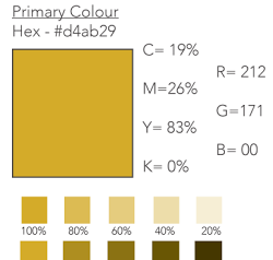
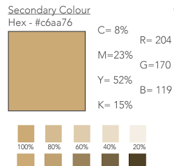
Suppose you’re brand new quite literally and splitting hairs about picking colors. We have some tips that can help you decide. Here are a list of colors and the traits or mood they exude. Alternatively, you can also learn more about the color principles professional designers use in this article.:
- Red: Danger, passion, excitement, heat, romance, vigor, action, and courage.
- Blue: Freedom, trust, loyalty, stability, intelligence, and imagination.
- Green: Nature, environmentally-friendly, safety, rejuvenation, life, growth, and energy.
- Yellow: Positivity, happiness, inspiration, creativity, vibrance, and warmth.
- Orange: Warm, approachable, spontaneous, enthusiastic, young, stimulating, and communicative.
- Pink: Romance, nurturance, femineity, gentleness, health, and vibrance.
- Purple: Royalty, spirituality, imagination, mystery, wealth, peace, and extravagance.
- Brown: Reliability, security, strength, earthiness, and conservativeness.
- Grey: Balance, neutrality, compromise, conservative, elegance, authority, and refinement.
- White: Purity, clean, innocence, wholesome, growth, and serenity.
- Black: Sophistication, boldness, simplicity, and power.
Step #3: Choose a Pattern Type
Now that you’ve gotten your brand personality and colors sorted, it’s time to translate them into the shapes and rhythm for your pattern background. To get your creative juices flowing, here are some pattern types and shapes you can consider.
Symmetrical Pattern Background
Symmetry represents predictability, trustworthiness, and professionalism but doesn’t exactly scream exciting. Symmetrical designs like the pattern designs below are the epitome of brand sincerity, sophistication, and loyalty.
But although many brand managers deem them effective across various product designs, the long-established theory might be considered outdated, according to Harvard Business Review. Studies associated symmetry with a duller personality and a seemingly less popular trend among consumers.

Chaotic Pattern Background
Enter, the nemesis of the direct opposite of symmetry’s order whose name is chaos. While some brands go for subtlety, others endeavor to portray a vibrant and loud personality that will capture attention. That said, chaotic patterns have to be applied with care because too much clutter and information can overwhelm the viewer and counterproductive in making a statement. Despite so, chaos with its abstractedness is unarguably more interesting to look at. Hence, you might want to hire the keen eye of a professional graphic designer to craft a unique pattern background for you.

Flower Pattern Background
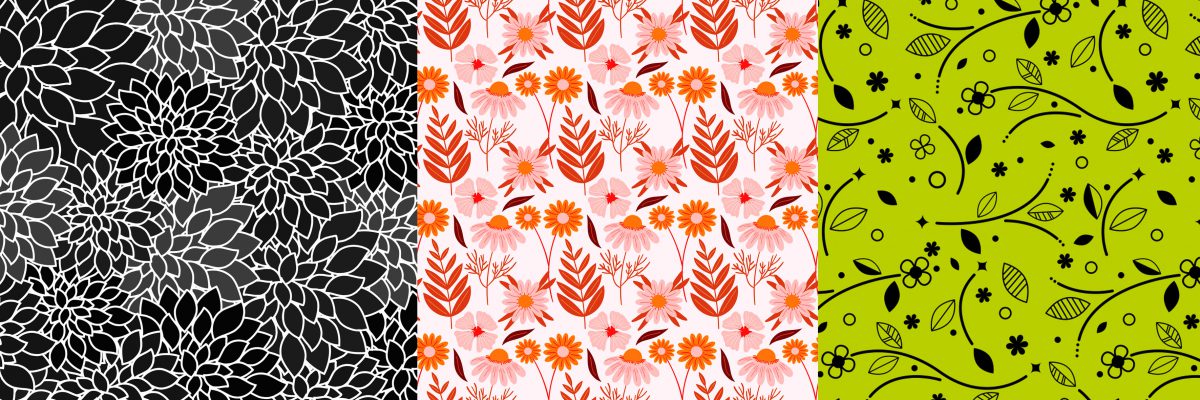
Floral pattern backgrounds will be a perfect fit if you represent a more earthy, spiritual, gentle, or feminine product. They’re popular and can be funky, loud, or subtle with the designer’s play in colors, illustration, and lines. Here are some samples of the cool, hip floral background that may tickle your inspiration.
Communicative Background
Want to put your brand out there and imprint your logo in your consumers’ minds? Logo or communicative backgrounds are great in increasing brand awareness.

They can be used for your product packaging (boxes, wrapping paper) or digitally for your website, Microsoft team virtual background, or social media. Never underestimate the power of your visual effects. You can learn more about visual effects for Google Meet here.
Communicative backgrounds can contain key messages, logos, and/or taglines. It’s, however, important to keep the clear space around your logo and make sure that your pattern background does not clash with any of the foreground content. As such, watermarks are sometimes a great idea as they are not interruptive and will reduce visual clutter.
Step 4: Get a Professional Eye
Seeing stars after hours of pattern background brainstorming? Hire a professional pattern background designer! It’s more affordable than you think. The big plus? Bunny Studio’s vetted graphic designers work to deliver stringently quality-checked pattern designs. That means a clean handover of images in your preferred format with all assets neatly named and layered for your future use. You can share your brand guidelines if you’ve already established one, or let the professional creative designers get to work in making you one!
Churn Patterns that Earn
Did you know that a third of the global brands incorporate blue in their brand design? Too mainstream for your taste? Tap off our ideas above to stand out from the crowd. It doesn’t matter if you’re looking at physical products or digital ones. In fact, research shows that bounce rates drastically increase when a website design is unappealing. So, packaging, no matter the channel, matters!
It’s your turn to catch some eyes with your pattern background. Keep in mind that clutter makes brands stutter, so apply clear space wisely! And if you don’t know how then hire someone who does. We promise the investment lasts and will be worth your while. After all, building a brand that lasts is always better than remedying a tarnished brand image.

