Hello everyone, and welcome back to our “What’s New” section! It’s the middle of the month again, and this time we’ve packed in plenty of goodness in a single post. First and foremost, if you’re reading this, then you’re probably noticing we’ve renovated our blog! But that’s not all we’ve been working on, and we’re very happy to show you what we’ve been keeping busy with.
First off, let’s get started with the top bit of news from this month.
We’ve Redesigned Our Blog!
As you can see, our blog is sporting a swanky new look. Of course, we didn’t just there, because it’s also sporting some awesome under-the-hood changes as well. Here’s a list of all the improvements we’ve made to our beloved blog:
New Design With More Organized Information
We know it looked good before, but why not take it a step further? Now, we’ve made it even easier than before to find the content you’re looking for and hop between the different categories at will. Also, we’ve made our design even more responsive, fast, and streamlined than before so you can access it from the device of your choice.
Better User Experience
We like going above and beyond for our clients, and that, of course, means that user experience is our queen. The new blog redesign is easier on the eyes, loads faster, runs better across all devices, and makes navigation a cinch. We’ve tested it extensively, and listened to the feedback we’ve received from all of our users; needless to say, we hope you’ll be very happy with the result.
New Categories
Great content is a way of life for us, and we’re constantly finding new categories and topics of interest to write about. Therefore, we’ve added new categories, like “Our Industry” that touch on topics near and dear to our hearts. We are in the industry of remote working, freelancing, and the gig economy, and we want to share our deep knowledge base with you.
New Design for Case Studies
Case studies show our different successes working with a broad range of clients. It’s no secret that we connect clients with the best freelancers the gig economy has to offer. But, where would we be if we didn’t offer truthful accounts of how our services can help improve your business, and make life easier for you? Our spankin’ new Case Studies page features some examples we’re especially proud of and shows you clear evidence of why going with Bunny Studio can help you achieve your business and organizational goals.
The Bunny Studio Podcast
We’re very proud to introduce the Bunny Studio Podcast! While reading is all well and good, many of us love a good podcast with our morning cup of coffee. Now, our newest labor of love is here to beam insights about remote working, freelancing, and the gig economy straight into your ears. Enjoy!
Made Finding Content Even Easier
Over time, our content base grew to hundreds, and then thousands of blog posts. And, while that is fantastic, it can be daunting for a first-time user to find just what they’re looking for in such a huge library. Our solution? We’ve thoroughly reorganized our content, and now it’s easier to find depending on your needs as a user:
- If you’re on the business side of things, click here.
- A freelancer, then? Have a look-see in here!
Visit our renovated blog and tell us what you think about the changes!
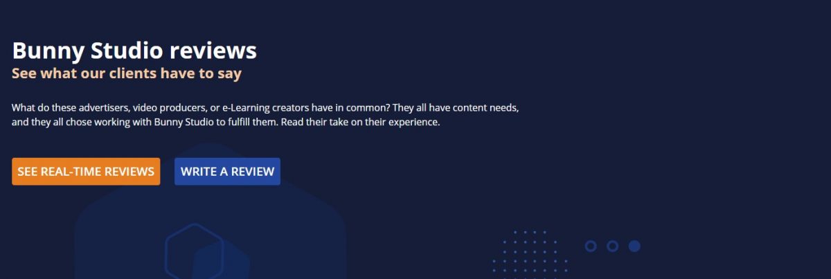
A New Page for Reviews and Case Studies
We now have a Review page, a single destination where to display the main takes of our case studies within our platform (not only on the blog) from a client perspective. That, combined with the real-time reviews, will help you, our clients, to make more informed choices when trying our services.
We include:
- A brief summary of our best case studies focused on the client’s testimonial.
- Real-time reviews shared by clients on our survey, which they signed onto after the project was completed.
- Users are invited to review us directly from this page.
Better Display for the Services Page
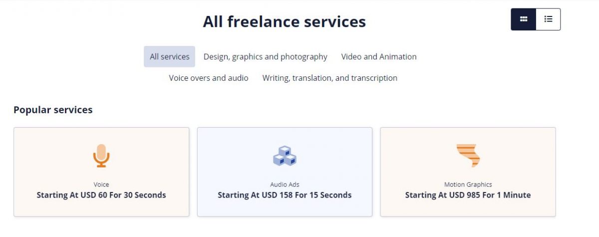
High-quality services are what we do. And, when you click on our services page, we aim to present the many options available to you in an easy-to-follow, attractive way. Our new redesign for the services page aims to do just that, and we hope you’ll be pleased with the result. With this revamped design, we’ve aimed to:
- Create a brand and modern UI that aligns with our design principles.
- An up-front display of the starting prices for our most popular services, something we know will make life easier for you when making a choice.
Now, all of the popular services are organized in a much simpler fashion. If you just scroll down the page, you’ll be able to easily find the one that matches your needs, and have a general idea of the starting price for each. Also, we’ve simplified how to access subcategories for each service so you don’t have to go browsing around and clicking on multiple pages to find the service of your choice; it’s all right there, very easy to access, and looks great to boot!
Improved Our Search Feature
Sometimes you can’t find what you’re looking for on your first try. And, hey, even the best systems sometimes let some information slip through the cracks, right? That’s why we’ve retooled our search feature and made anything you want much easier to find. You’ll see that:
- It’s much easier to see that we have other options to fulfill your projects that are not bookings right away, so you can find the shoe that fits.
- It’s easier to understand what Speedies and Contests are. No second-guessing here.
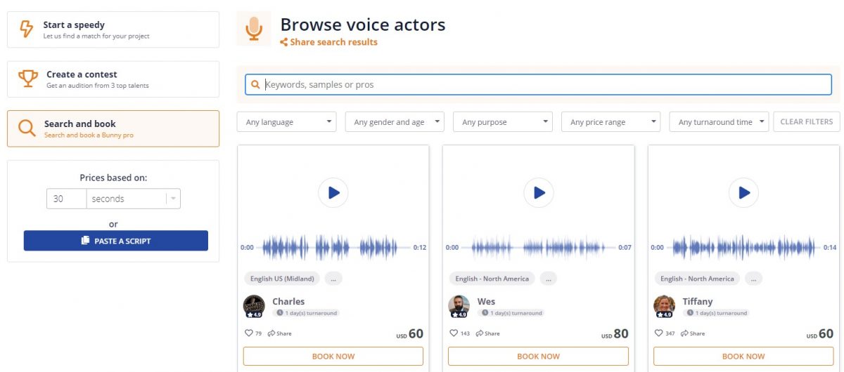
And now you can share the results with your collaborators as well! Say you’re searching for freelancers and want to share the results of your search? Now it’s just 1-2-3; we’ve included a Share option right on the top of the search Page! Or, if you find a sample that tickles your fancy, we’ve made it easy to share it over multiple platforms as well. You can’t say we’re not making things easy for you!

