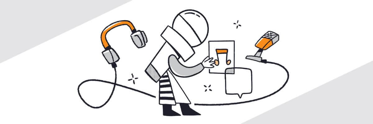
Your podcast cover art is your welcome sign, inviting listeners into your podcast and your world. When that cover art represents well, your potential listeners won’t be able to pass your podcast by, and soon enough they’ll be your loyal listeners instead.

But if you prefer to watch a video instead, click here:

Podcast Cover Art Can Speak to Your Listeners

Your podcast cover art is the first thing many of your potential listeners may see. Think about them scrolling through the pages of podcasts, looking for that new, perfect podcast to listen to. Maybe they’ll even subscribe to one or two. And then they see your cover art. They pause and then tap it. Your podcast is just what they imagined, all just from noticing your cover art. Soon they are loyal listeners, sharing stories of your podcast with their friends and recommending it to co-workers. Again, all from your cover art.

But how do you use your podcast cover art to capture the attention of new listeners? The Podcast Host offers some great questions to ask yourself when getting started on your podcast art. Take a look:

  • Think about what’s most important about your podcast.
  • What are your main topics of discussion?
  • What categories is your podcast in?

Once you have these few questions answered, you can move on with the visual part. This same article recommends thinking about a universal symbol to convey the concrete message of your podcast. Like a dollar sign for a financial podcast or film reel for an entertainment show. Then you can take it to a more figurative level. This is where you can include speech bubbles or glasses clinking or a big bold letter.

This is what your potential listeners will see, and the whole picture is what will take them to your show. And a dollar sign alone won’t be enough. There are a gillion finance podcasts out there. The other things you add to your cover art will be what seals the deal. Think about the color of your art, the style of the lines in your art, and the font. All of this dictates mood.

Podcast Cover Art for podcasters

Just like you brainstormed on your podcast ideas, you want to take some valuable time in creating your cover art. It’s amazing how the nonaudible parts of your podcast can have such an impact. So think of it this way. Imagine your podcast is a store and your cover art is the sign outside. What will draw those customers in to take the time to browse, hopefully even buy something? Your storefront has to be representative of your product, from aesthetics to mood. With the right storefront, in other words, podcast cover art, you can have a successful podcast where the listeners keep coming and maybe they’ll even bring. their friends.

Characteristics of Great Podcast Cover Art

We spoke about creating great cover art, and maybe it can begin with that concrete symbol. The Podcast Host again offers some great advice. Keep it simple and less is more. Once you have that symbol, make sure to keep it clean and simple. Then maybe you can add some words or another feature. The key here is simplicity.

Remember, many people are searching for a new podcast on their phones. Phones are small and the cover art you create will be small. Make sure what you create is still visually pleasing on a small screen. The Podcast Host recommends including no more than four elements in your cover art. They feature the podcast Spirits as having a great example of cover art. Let’s see why…

This is a podcast about drinking and discussing mythology, folklore, and urban legends. Each episode, they make a drink that pairs with that week’s subject. The podcast’s tagline is, “Kinda creepy, kinda cool.” Their cover art is simply a skull and martini glass with the word Spirits. It’s already a great title; the art fits perfectly. You can check out their logo on their website. The font is also clean and simple. No fancy embellishments of hard-to-read letters. It’s just simple. The colors, green and black, not only pop but also connect to the theme of creepy and cool. Well done, Spirits.

So in a nutshell, the keys to great cover art are:

  • Four or fewer images
  • Clean simple lines
  • An easy to read font
  • Artwork that will look good small
  • Great, representative colors that complement each other and don’t blend
  • Easy to connect to and easy to remember

Don’t Forget Size Specifications

Size is very important when it comes to podcast cover art. The worst is spending tons of time creating your art only to find out that it won’t work on Apple Podcasts (iTunes) or other platforms.

According to Buzzsprout.com, Apple Podcasts is the largest podcast platform and you certainly want to list your podcast there. However, you’ve got to be sure to meet specifications. According to the article,

Excerpts from iTunes Feed and Image Requirements:

[Cover art must be] a minimum size of 1400 x 1400 pixels and a maximum size of 3000 x 3000 pixels, 72 dpi, in JPEG or PNG format with appropriate file extensions (.jpg, .png), and in the RGB colorspace. To optimize images for mobile devices, Apple recommends compressing your image files.

Without this correct size, it will be a no-go on Apple Podcasts. Also, if you are looking to get into the New & Noteworthy section on Apple Podcasts, your artwork is going to have to be not only in the right dimensions but also aesthetically pleasing. And if you can get your podcast here, you’ll be set. It’s one of the first places people look to find a new podcast, and it won’t be buried beneath a plethora of other podcasts trying to make their mark. So above all, make sure you’ve got the right dimensions on your podcast cover art.

Is There a Difference In Cover Art and My Logo?

Sometimes people may refer to cover art and a podcast logo interchangeably, but there can be some subtle differences. When you are referring to cover art, it simply is the cover art. However, a logo can appear on any number of things relating to your podcast, from your website to your merch. So whereas your cover art may consist of your logo, your logo is a little broader than your cover art.

Beyond Apple Podcasts

We spoke about logos versus cover art. Here’s a big tip, when you are creating your cover art, think of how you can embed your logo in it. Or the other way around – think about how you can pull your logo from your cover art.

Let’s go back to the podcast Spirits. If you take a look at their website, it’s covered in their logo. Martini glasses and skulls. Just like on their cover art. It’s got the same creepy green shade, the same linear structure, but just a little different placement of the images. However, there’s a beautiful cohesion that brings it all together.

Then you click on their merch. Guess what? That same lovely cohesion is there, too. Their logo and their cover art are on shirts, hats, stickers, and pins. Not only is the cover art tied to the logo, but it’s tied to the website graphics and merch. That’s what success is. The artwork can connect an entire community by being recognizable, simple, and representative.

Other NonAudible Components of a Podcast

Of course, your topic and episodes are what make your podcast. But just like the podcast cover art, there are other components of a podcast that add to its success. Again, think of that brick and mortar store or a book and there is much more to both of those than the content inside.

Podcast Cover Art for podcasters

For a podcast, some of the important components are the title, the episode titles, the description, and even the merch.

The Title – Naming your podcast is huge. You’ve got to come up with something that is catchy and upfront. Sure, if you’re a big name already and have a following, there’s nothing wrong with naming your podcast after yourself. Other than that, think of something that will bring listeners to you. Keep it fairly short and make sure no one else has it already. Also, if you find something very close to it, think again. You want originality.

The Description – This is that simple blurb that tells the listener what you’re all about. Rachel Corbett shares great insight on this. Let the listener know what’s in it for them and give them a reason to listen. If you can do that, they will come.

The EpisodesCorbett shares information on this, too. Sure, many of the people reading your episode descriptions are already your listeners, but some new ones are reading this to. Make sure you send a vibe of what the show is as a whole while explaining each episode.

How to Make Podcast Cover Art

So you’ve done all the parts of your podcast. You have a great idea, great titles, and ideas for episodes. You’ve got a guest list ready to go and a schedule to follow. So it’s time to create your cover art. But wait, you can’t even create a stick figure and have no sense of aesthetics. Don’t worry. You can outsource this part of your show.

This is an easy thing to outsource. Plenty of freelancers and art agencies will take this on for you and create something perfect. Check sites like PodcastCoverology and Fiverr for professional artistic help. Your job here is conveying just what you want. Maybe not as far as the aesthetics go, but as far as the purpose and goal of your show go. You don’t have to tell them what you want visually, but you need to convey the vibe of your show. The more you can share about this, the better they can design a perfect cover for you.

Summing it Up and Putting it All Together

Clearly, podcast production is more than recording a great show. You’ve got lots of components to incorporate to make a successful podcast. The best big takeaway, whether it’s about your cover art or your description is to make it all simple, clear, and compelling. You want to bring in new listeners as well as connect with current listeners. You want a theme running throughout that sends a cohesive message to connect all the parts together. So when it comes to your podcast cover art, create something beautiful, something compelling, and something unique.